

- Back to Docs
- Get Started
- Integrations
- Configuring your Charts
- List of Charts
- Single Series Charts
- Pie
- Doughnut
- Column
- Bar
- Area
- Line
- Stacked Charts
- Stacked Column
- Stacked Bar
- Stacked Area
- Combination Charts
- Combination
- XY Plot Charts
- Scatter
- Bubble
- Gauges
- Angular Gauge
- Other Charts
- Funnel
- Pyramid
- Heatmap
- Sankey
- Chord
- Radar
- Timeseries
- Chart Attributes
- API
- Options & Properties
- Methods
- Events
- Other References
- Concepts
- Browser and Technology Support
- Change Log
- License Activation
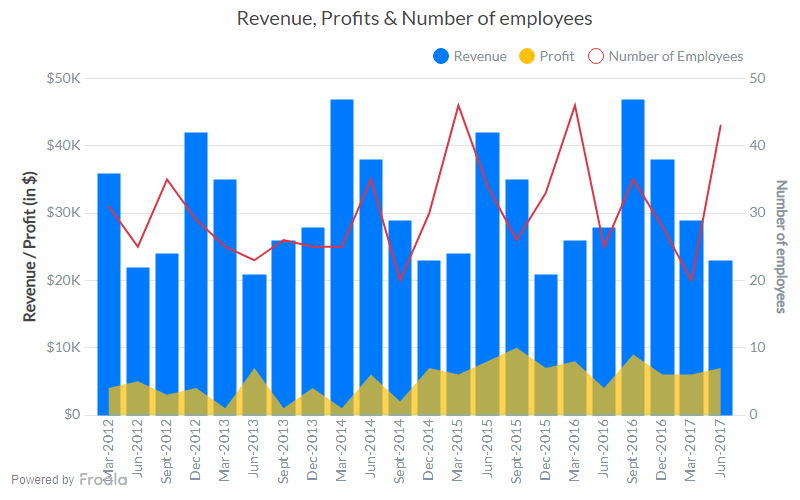
Combination Chart
The multi-series combination 2D dual y-axis chart is used to plot data that belongs to multiple categories and uses different units. The chart is rendered as a combination of the column, line, and area charts and a dual y-axis. The dual y-axis in this chart adds the flexibility to use an additional variable with an axis of its own. An icon legend is rendered to map data plots to their corresponding data categories; the icons can be clicked to show/hide data plots. This chart can be used to plot data like the targeted revenue, the actual revenue, and the profit percent on the same chart.
Create a Combination Chart
For a detailed list of attributes, refer to the Combination Chart attributes page.CHART
JSON
HTML
CHART
FroalaCharts will render here
JSON
{
  "chart": {
    "caption": "Revenue, Profits & Number of employees",
    "drawcrossline": "1",
    "yaxisname": "Revenue / Profit (in $)",
    "syaxisname": "Number of employees",
    "showvalues": "0",
    "showanchors": "0",
    "numberprefix": "$",
    "plothighlighteffect": "fadeout",
    "theme": "froala"
  },
  "categories": [
    {
      "category": [
        {
          "label": "Mar-2012"
        },
        {
          "label": "Jun-2012"
        },
        {
          "label": "Sept-2012"
        },
        {
          "label": "Dec-2012"
        },
        {
          "label": "Mar-2013"
        },
        {
          "label": "Jun-2013"
        },
        {
          "label": "Sept-2013"
        },
        {
          "label": "Dec-2013"
        },
        {
          "label": "Mar-2014"
        },
        {
          "label": "Jun-2014"
        },
        {
          "label": "Sept-2014"
        },
        {
          "label": "Dec-2014"
        },
        {
          "label": "Mar-2015"
        },
        {
          "label": "Jun-2015"
        },
        {
          "label": "Sept-2015"
        },
        {
          "label": "Dec-2015"
        },
        {
          "label": "Mar-2016"
        },
        {
          "label": "Jun-2016"
        },
        {
          "label": "Sept-2016"
        },
        {
          "label": "Dec-2016"
        },
        {
          "label": "Mar-2017"
        },
        {
          "label": "Jun-2017"
        }
      ]
    }
  ],
  "dataset": [
    {
      "seriesname": "Revenue",
      "plottooltext": "Revenue in $label : <b>$dataValue</b>",
      "data": [
        {
          "value": "36000"
        },
        {
          "value": "22000"
        },
        {
          "value": "24000"
        },
        {
          "value": "42000"
        },
        {
          "value": "35000"
        },
        {
          "value": "21000"
        },
        {
          "value": "26000"
        },
        {
          "value": "28000"
        },
        {
          "value": "47000"
        },
        {
          "value": "38000"
        },
        {
          "value": "29000"
        },
        {
          "value": "23000"
        },
        {
          "value": "24000"
        },
        {
          "value": "42000"
        },
        {
          "value": "35000"
        },
        {
          "value": "21000"
        },
        {
          "value": "26000"
        },
        {
          "value": "28000"
        },
        {
          "value": "47000"
        },
        {
          "value": "38000"
        },
        {
          "value": "29000"
        },
        {
          "value": "23000"
        }
      ]
    },
    {
      "seriesname": "Profit",
      "plottooltext": "Profit in $label : <b>$dataValue</b>",
      "renderas": "area",
      "showvalues": "0",
      "data": [
        {
          "value": "4000"
        },
        {
          "value": "5000"
        },
        {
          "value": "3000"
        },
        {
          "value": "4000"
        },
        {
          "value": "1000"
        },
        {
          "value": "7000"
        },
        {
          "value": "1000"
        },
        {
          "value": "4000"
        },
        {
          "value": "1000"
        },
        {
          "value": "6000"
        },
        {
          "value": "2000"
        },
        {
          "value": "7000"
        },
        {
          "value": "6000"
        },
        {
          "value": "8000"
        },
        {
          "value": "10000"
        },
        {
          "value": "7000"
        },
        {
          "value": "8000"
        },
        {
          "value": "4000"
        },
        {
          "value": "9000"
        },
        {
          "value": "6000"
        },
        {
          "value": "6000"
        },
        {
          "value": "7000"
        }
      ]
    },
    {
      "seriesname": "Number of Employees",
      "parentyaxis": "S",
      "renderas": "line",
      "showvalues": "0",
      "plottooltext": "$value employees",
      "data": [
        {
          "value": "31"
        },
        {
          "value": "25"
        },
        {
          "value": "35"
        },
        {
          "value": "29"
        },
        {
          "value": "25"
        },
        {
          "value": "23"
        },
        {
          "value": "26"
        },
        {
          "value": "25"
        },
        {
          "value": "25"
        },
        {
          "value": "35"
        },
        {
          "value": "20"
        },
        {
          "value": "30"
        },
        {
          "value": "46"
        },
        {
          "value": "34"
        },
        {
          "value": "26"
        },
        {
          "value": "33"
        },
        {
          "value": "46"
        },
        {
          "value": "25"
        },
        {
          "value": "35"
        },
        {
          "value": "28"
        },
        {
          "value": "20"
        },
        {
          "value": "43"
        }
      ]
    }
  ]
}
HTML
<html>

<head>
      <title>My first chart using FroalaCharts</title>

  <script src=https://unpkg.com/froalacharts@1.0.0/froalacharts.js></script>
  <script src="https://unpkg.com/froalacharts@1.0.0/themes/froalacharts.theme.froala.js"></script>

  <script type="text/javascript">
       var data = {
        chart: {
    caption: "Revenue, Profits & Number of employees",
    drawcrossline: "1",
    yaxisname: "Revenue / Profit (in $)",
    syaxisname: "Number of employees",
    showvalues: "0",
    showanchors: "0",
    numberprefix: "$",
    plothighlighteffect: "fadeout",
    theme: "froala"
  },
  categories: [
    {
      category: [
        {
          label: "Mar-2012"
        },
        {
          label: "Jun-2012"
        },
        {
          label: "Sept-2012"
        },
        {
          label: "Dec-2012"
        },
        {
          label: "Mar-2013"
        },
        {
          label: "Jun-2013"
        },
        {
          label: "Sept-2013"
        },
        {
          label: "Dec-2013"
        },
        {
          label: "Mar-2014"
        },
        {
          label: "Jun-2014"
        },
        {
          label: "Sept-2014"
        },
        {
          label: "Dec-2014"
        },
        {
          label: "Mar-2015"
        },
        {
          label: "Jun-2015"
        },
        {
          label: "Sept-2015"
        },
        {
          label: "Dec-2015"
        },
        {
          label: "Mar-2016"
        },
        {
          label: "Jun-2016"
        },
        {
          label: "Sept-2016"
        },
        {
          label: "Dec-2016"
        },
        {
          label: "Mar-2017"
        },
        {
          label: "Jun-2017"
        }
      ]
    }
  ],
  dataset: [
    {
      seriesname: "Revenue",
      plottooltext: "Revenue in $label : $dataValue",
      data: [
        {
          value: "36000"
        },
        {
          value: "22000"
        },
        {
          value: "24000"
        },
        {
          value: "42000"
        },
        {
          value: "35000"
        },
        {
          value: "21000"
        },
        {
          value: "26000"
        },
        {
          value: "28000"
        },
        {
          value: "47000"
        },
        {
          value: "38000"
        },
        {
          value: "29000"
        },
        {
          value: "23000"
        },
        {
          value: "24000"
        },
        {
          value: "42000"
        },
        {
          value: "35000"
        },
        {
          value: "21000"
        },
        {
          value: "26000"
        },
        {
          value: "28000"
        },
        {
          value: "47000"
        },
        {
          value: "38000"
        },
        {
          value: "29000"
        },
        {
          value: "23000"
        }
      ]
    },
    {
      seriesname: "Profit",
      plottooltext: "Profit in $label : $dataValue",
      renderas: "area",
      showvalues: "0",
      data: [
        {
          value: "4000"
        },
        {
          value: "5000"
        },
        {
          value: "3000"
        },
        {
          value: "4000"
        },
        {
          value: "1000"
        },
        {
          value: "7000"
        },
        {
          value: "1000"
        },
        {
          value: "4000"
        },
        {
          value: "1000"
        },
        {
          value: "6000"
        },
        {
          value: "2000"
        },
        {
          value: "7000"
        },
        {
          value: "6000"
        },
        {
          value: "8000"
        },
        {
          value: "10000"
        },
        {
          value: "7000"
        },
        {
          value: "8000"
        },
        {
          value: "4000"
        },
        {
          value: "9000"
        },
        {
          value: "6000"
        },
        {
          value: "6000"
        },
        {
          value: "7000"
        }
      ]
    },
    {
      seriesname: "Number of Employees",
      parentyaxis: "S",
      renderas: "line",
      showvalues: "0",
      plottooltext: "$value employees",
      data: [
        {
          value: "31"
        },
        {
          value: "25"
        },
        {
          value: "35"
        },
        {
          value: "29"
        },
        {
          value: "25"
        },
        {
          value: "23"
        },
        {
          value: "26"
        },
        {
          value: "25"
        },
        {
          value: "25"
        },
        {
          value: "35"
        },
        {
          value: "20"
        },
        {
          value: "30"
        },
        {
          value: "46"
        },
        {
          value: "34"
        },
        {
          value: "26"
        },
        {
          value: "33"
        },
        {
          value: "46"
        },
        {
          value: "25"
        },
        {
          value: "35"
        },
        {
          value: "28"
        },
        {
          value: "20"
        },
        {
          value: "43"
        }
      ]
    }
  ]
};

FroalaCharts.ready(function () {
            froalacharts = new FroalaCharts({
                id: "chart_1",
                type: 'combination',
                renderAt: 'ft',
                width: '800',
                height: '500',
                dataSource: data
            });
            froalacharts.render();
        });
    </script>

</head>


<div id="msg" class="mb-20"> Chart data in the selected format will be displayed here.</div>

<body>
    <div id="ft">FroalaCharts will render here</div>
</body>

</html>