

Angular gauges are essentially like the speedometer or the fuel gauge of a car. You can use an angular gauge (also called a meter or dial gauge) to display a specific data point, using a dial over a radial scale with defined limits. You can associate colors with sections of the data to indicate specific ranges within the data, e.g., green for satisfactory, yellow for caution, and red for alarm.
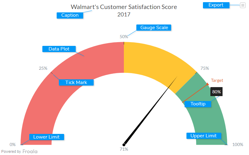
Caption
The caption (also called the chart title) is the heading of your chart. You can add custom text for the caption, as well as configure its font properties and cosmetics. Learn more about it
Data Plot
Data plot refers to the columns of the dial in an angular gauge.
Lower Limit
Lower Limit refers to the lowest point in the reference scale used in the gauge.
Upper Limit
Upper Limit refers to the highest point in the reference scale used in the gauge.
Tick Mark
Tick marks are placed at regular intervals on the gauge scale, to indicate data values.
Gauge Scale
The gauge scale displays all possible values between the lower and upper limits.
Tooltip
A tooltip is displayed when the mouse cursor hovers over a particular data point. It denotes valuable information about the data plot hovered.
Export Menu
Export menu that appears on top-right of the chart, it offers different options to export a chart.
You can enable or disable chart export using attributeexportEnabled. Refer to Exporting Charts to learn
more.