


Step-by-Step Guide to Building a Responsive Website with a Bootstrap WYSIWYG Editor
Posted on By Carl Cruz | Last updated on | In Editor, General
Table of contents
- What is Bootstrap, and why use it?
- Key features
- Why choose Bootstrap?
- Pros:
- Cons:
- Overview of Bootstrap WYSIWYG editors
- What is a Bootstrap-compatible WYSIWYG editor?
- WYSIWYG vs. Code-based editors
- Bootstrap-compatible editors to consider
- How to choose the right Bootstrap WYSIWYG editor
- Preparation: setting up your project
- Choosing a bootstrap-compatible editor
- Creating a new project
- Overview of bootstrap file structure
- Importing Bootstrap, Filestack, and Froala
- Step-by-step: Building your responsive website
- Step 1: Build a sticky navbar
- Step 2: Create a hero section
- Step 3: Add an image carousel
- Step 4: Enable image upload with Filestack
- Step 5: Display adoptable dogs with cards
- Step 6: Add a pricing section with cards
- Step 7: Add a comment section with Froala
- Testing and optimization
- Preview and test
- Optimize performance
- Exporting and going live
- Exporting your project
- Hosting options
- Connecting a domain
- Basic SEO and meta tags
- Advanced tips and next steps
- Integrate with modern frameworks
- Use Bootstrap themes and templates
- Learn SCSS for deeper customization
- Prioritize accessibility
- Conclusion

The digital world demands responsive web design as an essential requirement. Users now access websites from phones, tablets, and desktops—your site must deliver a smooth experience across all screen sizes.
One of the best solutions is Bootstrap, the popular front-end framework for building mobile-first designs. But writing code manually isn’t for everyone. That’s where a Bootstrap WYSIWYG editor comes in—combining drag-and-drop simplicity with Bootstrap’s responsive grid system. With these editors, you can create professional, mobile-friendly websites without starting from scratch.
What is Bootstrap, and why use it?
Bootstrap is a popular front-end framework originally developed by Twitter in 2011. It was built to help developers create consistent, responsive designs more efficiently. Today, it powers millions of websites and is currently in its fifth major version (Bootstrap 5), offering modern features and a mobile-first approach.
Key features
- Grid System: Bootstrap’s 12-column layout makes it easy to create responsive page structures.
- Components: Prebuilt elements like buttons, navbars, cards, and modals speed up development.
- Utility Classes: Apply spacing, colors, alignment, and more directly in HTML.
- Mobile-First Design: All components are designed to look great on small screens first.
Why choose Bootstrap?
Bootstrap stands out for its ease of use and flexibility. You can build sleek, functional websites without starting from scratch or writing a lot of custom CSS.
Pros:
- Fast prototyping with reusable components.
- Built-in responsiveness.
- Strong community and documentation.
- Easy to integrate with most editors and tools.
Cons:
- May include more code than needed for small projects.
- Customizing deeply can be challenging.
- Websites can look similar if not styled further.
Overall, Bootstrap is a solid choice for building responsive sites quickly, especially when paired with a visual editor to simplify the process.
Check out all the Bootstrap classes here.
Overview of Bootstrap WYSIWYG editors
When building responsive websites with Bootstrap, many developers also want to offer live editing capabilities — whether it’s for a content management system, admin panel, or inline content editing experience. That’s where WYSIWYG Bootstrap editors come into play.
These are not standalone site builders — instead, they are embeddable editors that integrate into your Bootstrap-based website, allowing users to edit content directly on the page while preserving Bootstrap’s layout and styling.
What is a Bootstrap-compatible WYSIWYG editor?
A Bootstrap-compatible WYSIWYG (What You See Is What You Get) editor is an embeddable content editor that works seamlessly with Bootstrap’s grid system, components, and utility classes. These editors let users update text, images, media, and layout blocks inside a live Bootstrap site without breaking responsive design.
WYSIWYG vs. Code-based editors
- WYSIWYG editors like Froala are designed for non-technical users or content editors who need to make real-time updates without writing code. They’re often integrated into CMSs, admin dashboards, and SaaS applications.
- Code-based editors, in contrast, are used by developers to manually write and maintain HTML/CSS/JS. They’re ideal for full-code control but aren’t suitable for non-technical content editing.
Bootstrap-compatible editors to consider
Here are some WYSIWYG editors that integrate well into Bootstrap-based websites:
- Froala – A clean, lightweight, and highly customizable WYSIWYG HTML editor. Froala is Bootstrap-aware, supports inline editing, offers a responsive UI, and can be embedded directly into any Bootstrap project. It also supports custom toolbars, image uploads, code view, and works well in modern JavaScript frameworks.
- TinyMCE – Another popular embeddable WYSIWYG editor that can be styled to match Bootstrap. Offers plugin-based customization and responsive layouts.
- CKEditor – A rich editor that integrates with responsive frameworks, including Bootstrap. It has collaboration features and enterprise-ready tooling.
Note: Tools like Bootstrap Studio or Pinegrow are layout builders, not embeddable editors for Bootstrap websites. They are great for prototyping, but they don’t offer live, in-browser editing like Froala does.
How to choose the right Bootstrap WYSIWYG editor
When picking an editor for your Bootstrap website, consider:
- Bootstrap Compatibility – Does the editor respect your existing layout and CSS classes?
- Ease of Integration – Can it be easily embedded with minimal setup?
- Responsiveness – Does it adapt across devices like your Bootstrap site?
- Customizability – Can you extend or modify its UI and features?
If you’re looking to add live, responsive content editing to your Bootstrap website, Froala offers one of the smoothest and most developer-friendly integrations available.
Preparation: setting up your project
Before we dive into building our website, we need to set up a clean development environment. In this tutorial, we’ll create a dog adoption agency website to demonstrate how you can embed a WYSIWYG editor like Froala, use Bootstrap for layout and responsiveness, and integrate Filestack for handling images.
These tools work seamlessly together:
- Bootstrap handles layout and design.
- Froala provides inline content editing.
- Filestack simplifies uploading and managing media.
Choosing a bootstrap-compatible editor
For this guide, we’re using Froala Editor. It’s a lightweight, embeddable WYSIWYG editor that fits perfectly into modern responsive websites. Froala is Bootstrap-aware — it respects your layout, classes, and components — and it allows users to edit content directly inside styled elements like cards, columns, or even modals.
Creating a new project
Start by organizing your files with a simple directory structure:
/bootstrap-froala-site
├── index.html
├── /css
│ └── style.css
├── /js
│ └── script.js
└── /assets
└── images/
This setup makes it easier to manage your code, styles, scripts, and media as your site grows.
Overview of bootstrap file structure
When building with Bootstrap 5, the core files you’ll need are:
- bootstrap.min.css – for responsive styling and layout utilities.
- bootstrap.bundle.min.js – includes Bootstrap’s interactive JavaScript components (like modals and dropdowns) and dependencies like Popper.js.
In addition, we’ll include:
- Froala CSS/JS – to enable rich-text editing.
- Filestack SDK – to enable media upload and processing.
Importing Bootstrap, Filestack, and Froala
Below is the basic HTML skeleton you can use. Notice that we’ve included Bootstrap, Filestack, and Froala scripts. These files enable you to leverage Bootstrap for responsive layout, work with Filestack for image handling, and embed Froala for live content editing:
index.html
<!DOCTYPE html>

<html lang="en">

<head>

    <meta charset="UTF-8">

    <title>Dog Adoption Agency</title>

    <meta name="viewport" content="width=device-width, initial-scale=1.0"> <!-- Bootstrap CSS -->

    <link rel="stylesheet" href="https://cdn.jsdelivr.net/npm/bootstrap@5.3.0/dist/css/bootstrap.min.css">

    <!-- Froala Editor CSS -->

    <link href='https://cdn.jsdelivr.net/npm/froala-editor@4.3/css/froala_editor.pkgd.min.css' rel='stylesheet'

        type='text/css' /> <!-- Filestack JS and CSS (Picker, Drag-and-Drop, Transforms) -->

    <script src="https://static.filestackapi.com/filestack-js/3.32.0/filestack.min.js"> </script>

    <script

        src="https://static.filestackapi.com/filestack-drag-and-drop-js/1.1.1/filestack-drag-and-drop.min.js"> </script>

    <script src="https://static.filestackapi.com/transforms-ui/2.x.x/transforms.umd.min.js"> </script>

    <link rel="stylesheet" href="https://static.filestackapi.com/transforms-ui/2.x.x/transforms.css" />

    <!-- Froala Editor JS -->

    <script type='text/javascript'

        src='https://cdn.jsdelivr.net/npm/froala-editor@4.3/js/froala_editor.pkgd.min.js'> </script>

</head>

<body> <!-- Content goes here --> <!-- Bootstrap JS -->

    <script src="https://cdn.jsdelivr.net/npm/bootstrap@5.3.0/dist/js/bootstrap.bundle.min.js"> </script>

</body>


</html>
With this setup, you’re ready to start building your dog adoption agency website with embedded editing, responsive layout, and modern media capabilities.
Step-by-step: Building your responsive website
With our project environment set up and Bootstrap, Froala, and Filestack integrated, let’s start building the dog adoption agency website section by section. We’ll walk through how to structure the layout, embed interactive components, and bring the site to life using Bootstrap’s utility classes and JavaScript components — all while enabling rich content editing and image uploads.
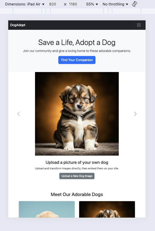
Step 1: Build a sticky navbar
Start with a Bootstrap sticky navbar that stays fixed to the top as users scroll. It contains anchor links that smoothly guide users to each section of the page.
index.html – inside the <body> tag
<nav class="navbar navbar-expand-lg navbar-dark bg-dark sticky-top">

  <div class="container-fluid">

    <a class="navbar-brand" href="#">DogAdopt</a>

    <button class="navbar-toggler" type="button" data-bs-toggle="collapse" data-bs-target="#navbarNav">

      <span class="navbar-toggler-icon"></span>

    </button>

    <div class="collapse navbar-collapse" id="navbarNav">

      <ul class="navbar-nav ms-auto">

        <li class="nav-item"><a class="nav-link active" href="#">Home</a></li>

        <li class="nav-item"><a class="nav-link" href="#adopt">Adoptable Dogs</a></li>

        <li class="nav-item"><a class="nav-link" href="#pricing">Pricing</a></li>

        <li class="nav-item"><a class="nav-link" href="#comment">Comment</a></li>

      </ul>

    </div>

  </div>

</nav>
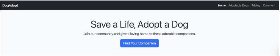
Step 2: Create a hero section
Use a simple Bootstrap hero layout to grab attention with a clear message and call to action.
index.html – inside the <body> tag
<section class="bg-light text-dark py-5 text-center">

  <div class="container">

    <h1 class="display-4">Save a Life, Adopt a Dog</h1>

    <p class="lead">Join our community and give a loving home to these adorable companions.</p>

    <a href="#adopt" class="btn btn-primary btn-lg">Find Your Companion</a>

  </div>

</section>
So far, your page should look something like this:
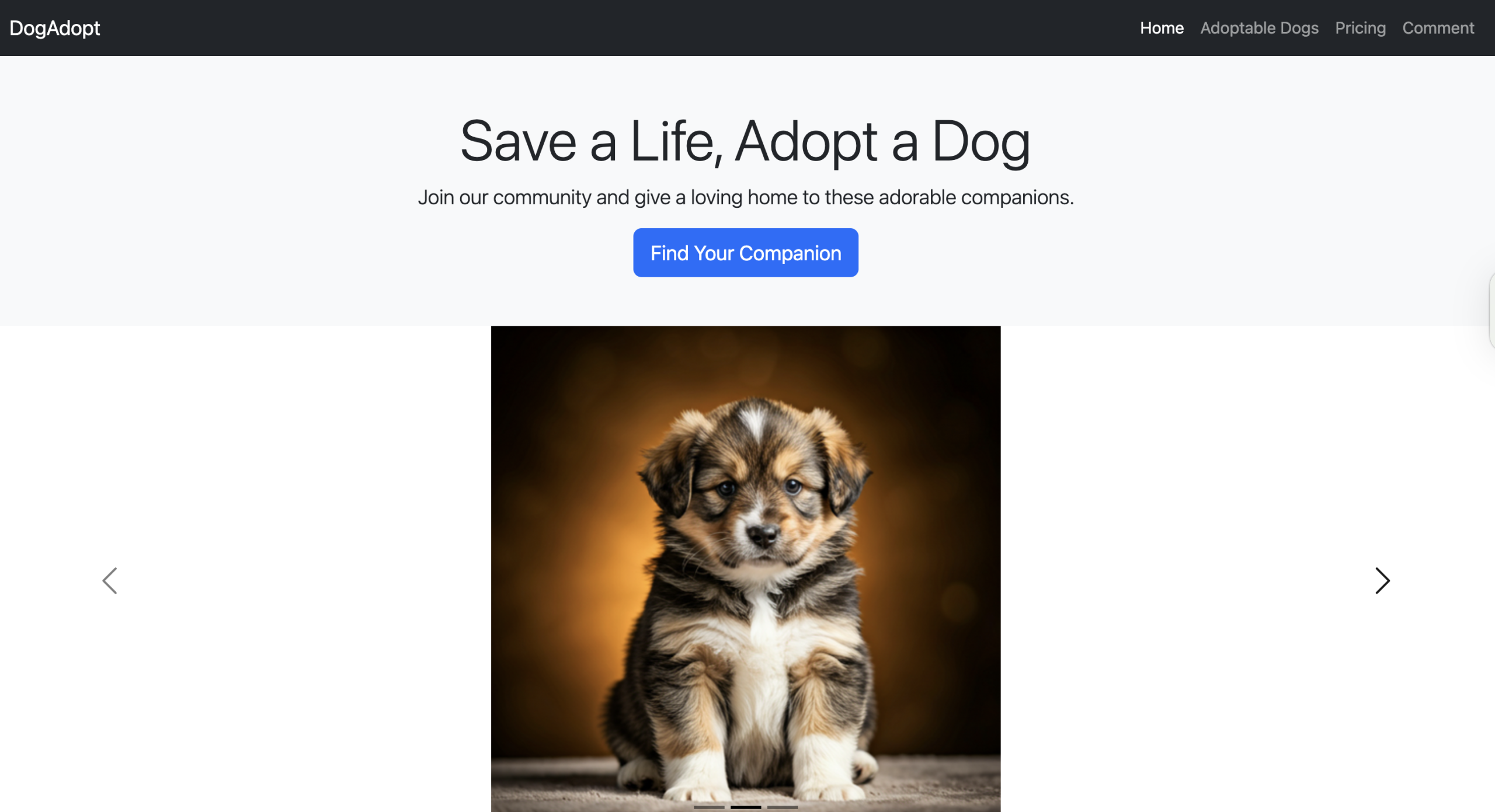
Step 3: Add an image carousel
Bootstrap’s carousel component highlights adoptable dogs using high-quality Filestack-transformed images.
index.html – inside the <body> tag
<!-- Add an image carousel -->
    <div id="dogCarousel" class="carousel carousel-dark slide" data-bs-ride="carousel">
        <div class="carousel-indicators"> <button type="button" data-bs-target="#dogCarousel" data-bs-slide-to="0"
                class="active" aria-current="true"></button> <button type="button" data-bs-target="#dogCarousel"
                data-bs-slide-to="1"></button> <button type="button" data-bs-target="#dogCarousel"
                data-bs-slide-to="2"></button> </div>
        <div class="carousel-inner">
            <div class="carousel-item active"> <img
                    src="https://cdn.filestackcontent.com/resize=width:1200,height:500/hmzhYgUSZiIA0Ju2ocMo"
                    class="d-block w-20" alt="Friendly Dog 1"> </div>
            <div class="carousel-item"> <img
                    src="https://cdn.filestackcontent.com/resize=width:1200,height:500/xsFLOcdRYKQOz4oQpmgg"
                    class="d-block w-20" alt="Friendly Dog 2"> </div>
            <div class="carousel-item"> <img
                    src="https://cdn.filestackcontent.com/resize=width:1200,height:500/e0DUJOjTjWmUQm0FxL7e"
                    class="d-block w-20" alt="Friendly Dog 3"> </div>
        </div> <button class="carousel-control-prev" type="button" data-bs-target="#dogCarousel" data-bs-slide="prev">
            <span class="carousel-control-prev-icon" aria-hidden="true"></span> <span
                class="visually-hidden">Previous</span> </button> <button class="carousel-control-next" type="button"
            data-bs-target="#dogCarousel" data-bs-slide="next"> <span class="carousel-control-next-icon"
                aria-hidden="true"></span> <span class="visually-hidden">Next</span> </button>
    </div>
Update the image URLs with your Filestack handles or transformed links.
To center the images within the carousel, add the following CSS. You can place it in your style.css file (if you’re using a separate stylesheet) or directly in your index.html file, just inside the <style> tag and placed within the <head> section.
Style.css
<style>

    .carousel-inner img {

        margin: auto;

    }

</style>
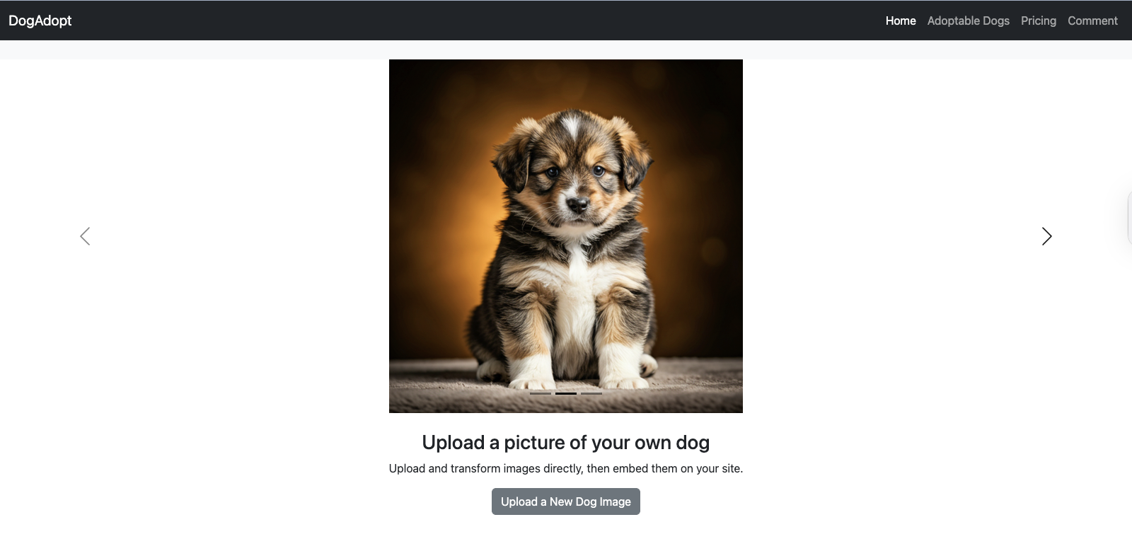
Here’s how your page should be shaping up so far:
Step 4: Enable image upload with Filestack
Embed a Filestack picker to let users upload new dog images:
index.html – inside the <body> tag
<!-- Filestack Mini-Section -->

    <section class="py-4 text-center">

        <div class="container">

            <h3>Upload a picture of your own dog</h3>

            <p>Upload and transform images directly, then embed them on your site.</p>

            <button class="btn btn-secondary" onclick="openFilestackPicker()">Upload a New Dog Image</button>

        </div>

    </section>

<script>

    const client = filestack.init('YOUR_API_KEY'); // Replace 'YOUR_API_KEY' with your actual Filestack API key.

    function openFilestackPicker() {

        client.picker({

        onUploadDone: (res) => {

            console.log('Uploaded file handle:', res.filesUploaded[0].handle);

        }

        }).open();

    }

 </script>
Replace ‘YOUR_API_KEY’ with your actual Filestack API key.
Sign up for free today to get your Filestack API key.
You can also place the script in a separate script.js file and reference it in the <body> section of your index.html file like this:
<script src="js/script.js"></script>
Make sure the path matches your folder structure (e.g., js/ in this case).
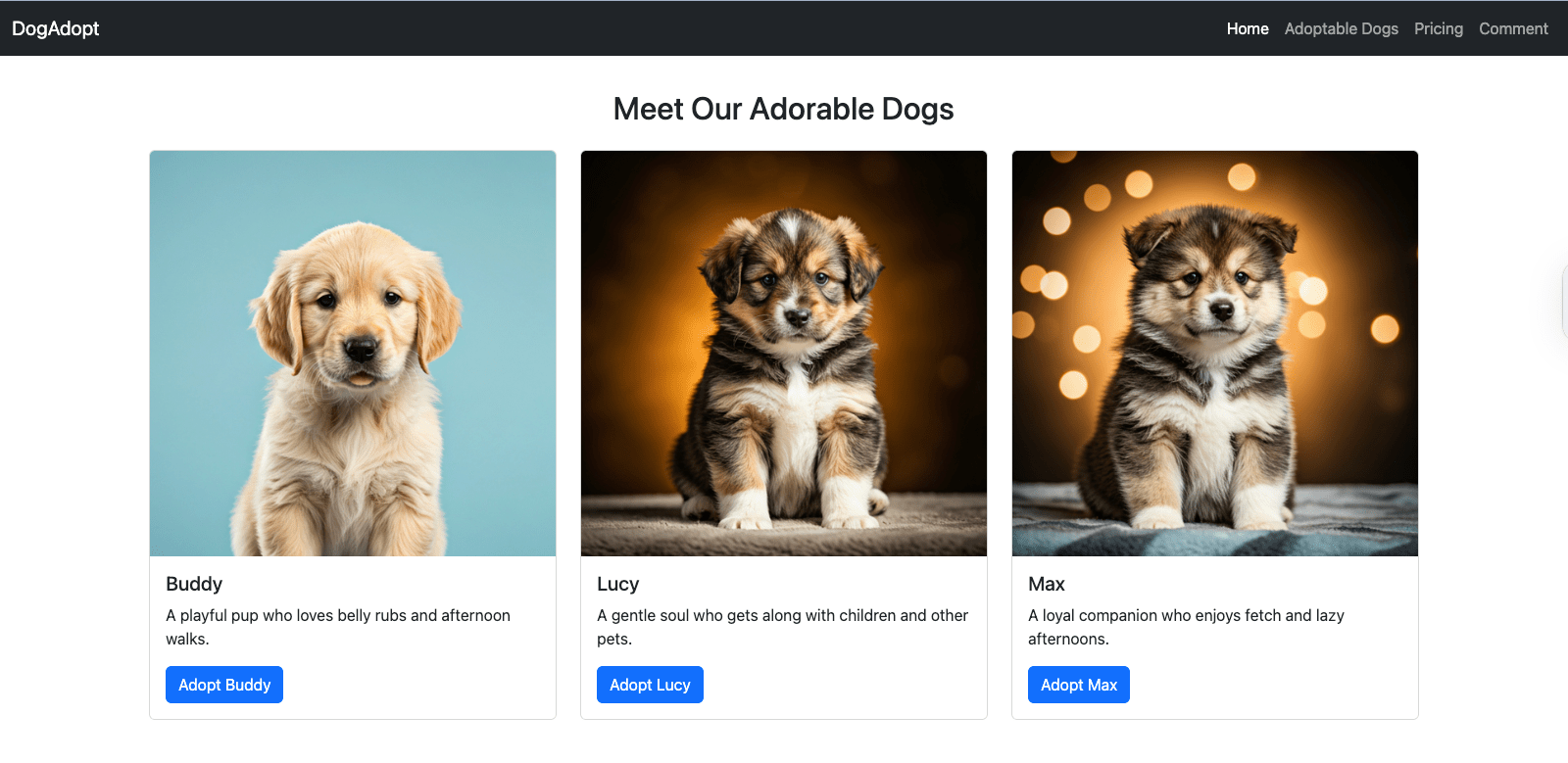
Step 5: Display adoptable dogs with cards
Showcase adoptable dogs using Bootstrap cards:
index.html – inside the <body> tag
<!--Display adoptable dogs with cards-->

<section id="adopt" class="py-5">

        <div class="container">

            <h2 class="mb-4 text-center">Meet Our Adorable Dogs</h2>

            <div class="row">

                <div class="col-md-6 col-lg-4 mb-4">

                    <div class="card"> <img

                            src="https://cdn.filestackcontent.com/resize=width:1200,height:500/hmzhYgUSZiIA0Ju2ocMo"

                            class="card-img-top" alt="Buddy">

                        <div class="card-body">

                            <h5 class="card-title">Buddy</h5>

                            <p class="card-text">A playful pup who loves belly rubs and afternoon walks.</p> <a href="#"

                                class="btn btn-primary">Adopt Buddy</a>

                        </div>

                    </div>

                </div>

                <div class="col-md-6 col-lg-4 mb-4">

                    <div class="card"> <img

                            src="https://cdn.filestackcontent.com/resize=width:1200,height:500/xsFLOcdRYKQOz4oQpmgg"

                            class="card-img-top" alt="Lucy">

                        <div class="card-body">

                            <h5 class="card-title">Lucy</h5>

                            <p class="card-text">A gentle soul who gets along with children and other pets.</p> <a href="#"

                                class="btn btn-primary">Adopt Lucy</a>

                        </div>

                    </div>

                </div>

                <div class="col-md-6 col-lg-4 mb-4">

                    <div class="card"> <img

                            src="https://cdn.filestackcontent.com/resize=width:1200,height:500/e0DUJOjTjWmUQm0FxL7e"

                            class="card-img-top" alt="Max">

                        <div class="card-body">

                            <h5 class="card-title">Max</h5>

                            <p class="card-text">A loyal companion who enjoys fetch and lazy afternoons.</p> <a href="#"

                                class="btn btn-primary">Adopt Max</a>

                        </div>

                    </div>

                </div>

            </div>

        </div>

    </section>
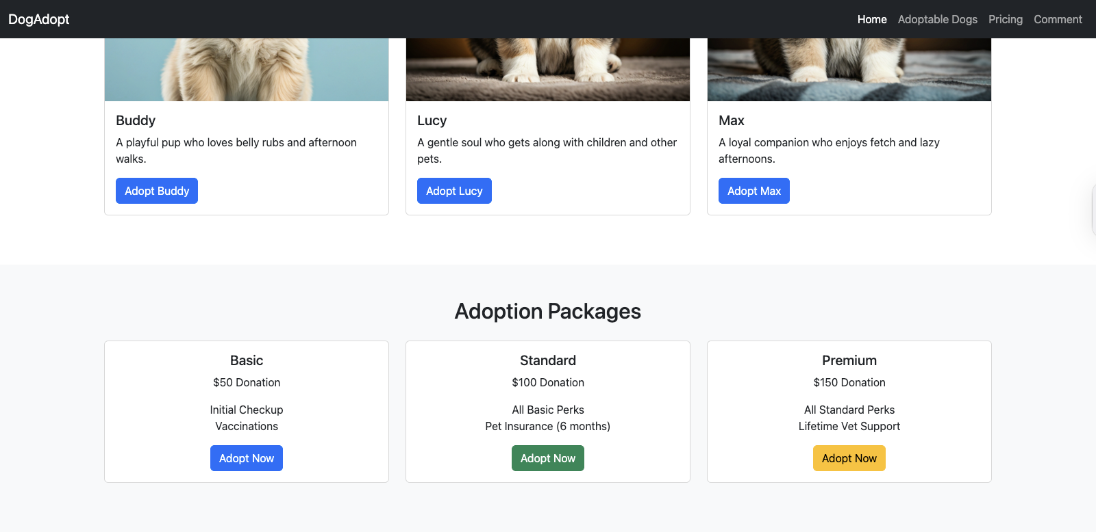
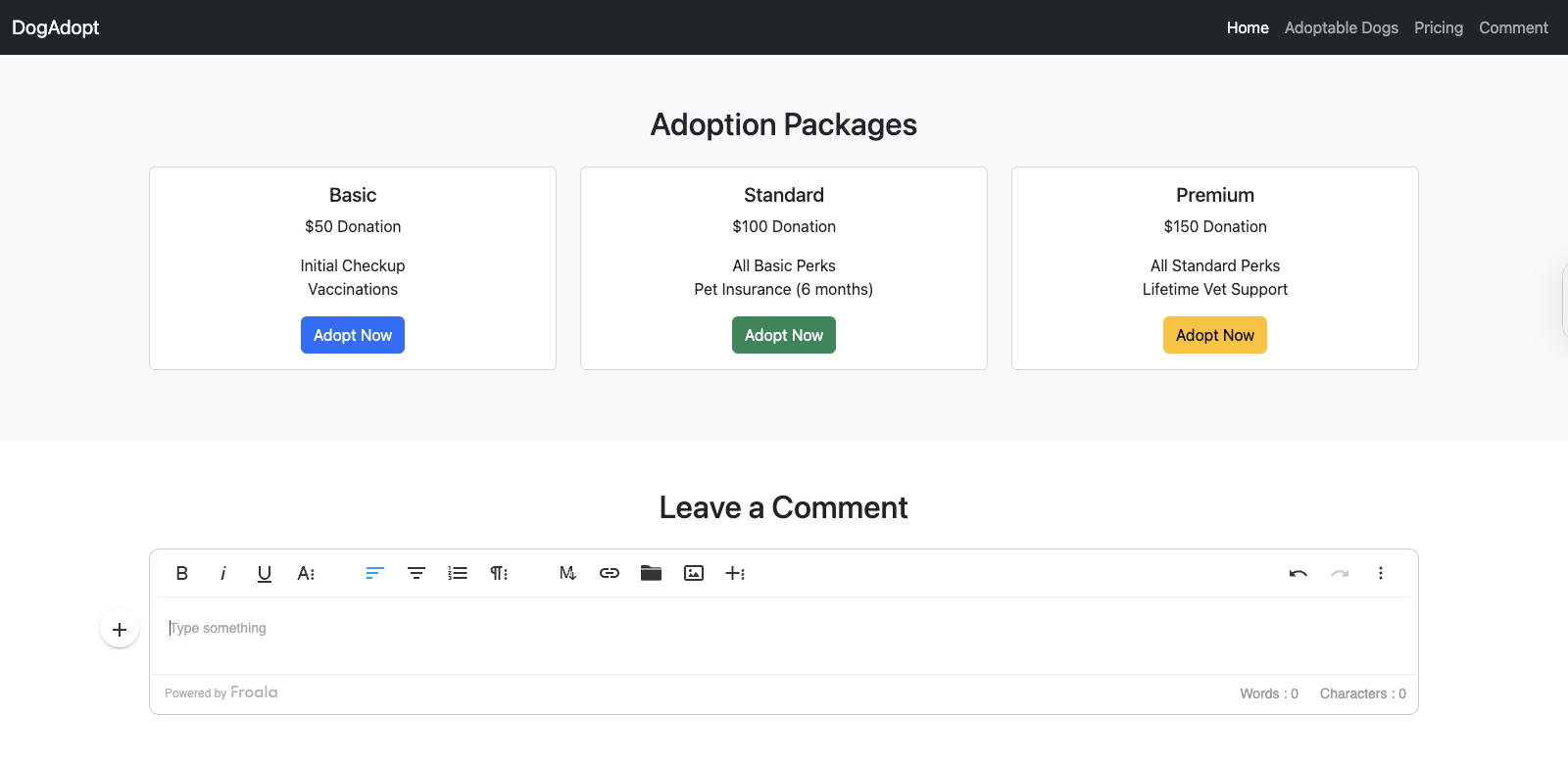
Step 6: Add a pricing section with cards
Showcase your adoption packages using Bootstrap cards combined with utility classes for spacing and layout.
index.html – inside the <body> tag
<!--Add Pricing section-->

    <section id="pricing" class="bg-light py-5">

        <div class="container text-center">

            <h2 class="mb-4">Adoption Packages</h2>

            <div class="row">

                <div class="col-md-4 mb-4">

                    <div class="card h-100">

                        <div class="card-body">

                            <h5 class="card-title">Basic</h5>

                            <p class="card-text">$50 Donation</p>

                            <ul class="list-unstyled">

                                <li>Initial Checkup</li>

                                <li>Vaccinations</li>

                            </ul> <a href="#" class="btn btn-primary">Adopt Now</a>

                        </div>

                    </div>

                </div>

                <div class="col-md-4 mb-4">

                    <div class="card h-100">

                        <div class="card-body">

                            <h5 class="card-title">Standard</h5>

                            <p class="card-text">$100 Donation</p>

                            <ul class="list-unstyled">

                                <li>All Basic Perks</li>

                                <li>Pet Insurance (6 months)</li>

                            </ul> <a href="#" class="btn btn-success">Adopt Now</a>

                        </div>

                    </div>

                </div>

                <div class="col-md-4 mb-4">

                    <div class="card h-100">

                        <div class="card-body">

                            <h5 class="card-title">Premium</h5>

                            <p class="card-text">$150 Donation</p>

                            <ul class="list-unstyled">

                                <li>All Standard Perks</li>

                                <li>Lifetime Vet Support</li>

                            </ul> <a href="#" class="btn btn-warning">Adopt Now</a>

                        </div>

                    </div>

                </div>

            </div>

        </div>

    </section>
Step 7: Add a comment section with Froala
Enable live WYSIWYG editing using Froala Editor for user comments.
<!--Adding a Bootstrap Editor WYSIWYG Froala-->
    <section id="comment" class="py-5">
        <div class="container">
            <h2 class="mb-4 text-center">Leave a Comment</h2>
            <div id="editor"></div>
        </div>
    </section>
    <script> var editor = new FroalaEditor('#editor', {
        imageEditButtons: ['imageReplace', 'imageAlign', 'imageCaption', 'filestackIcon', 'imageTUI'], filestackOptions: {
            uploadToFilestackOnly: false, filestackAPI: '***', // Replace with your Filestack API key

            pickerOptions: { fromSources: ['local_file_system', 'imagesearch', 'url', 'googledrive', 'facebook'], accept: [".pdf", "image/jpeg", "image/png", "image/webp", "video/*", "audio/*"], transformations: { crop: true, rotate: true } }
        },
    });
    </script>
With these steps, your responsive website now includes:
- A mobile-friendly layout with Bootstrap
- Live content editing powered by Froala
- Image uploads and transformations via Filestack
Check out the full example on our GitHub repo!
Next, we’ll look at testing, optimization, and going live.
Testing and optimization
Before going live, ensure your site looks great and performs well across all devices.
Preview and test
- Use Chrome DevTools or built-in browser tools to preview different screen sizes.
- Test on major browsers like Chrome, Firefox, Safari, and Edge.
- View your site on real phones or tablets when possible.
Optimize performance
- Minify your HTML, CSS, and JS files to reduce load time.
- Compress and resize images using Filestack or similar tools.
- Use lazy loading for images and videos to boost speed, especially on mobile.
Exporting and going live
Once your dog adoption website is complete, it’s time to bring it online. This final step outlines how to export your project, host it, and make it accessible to users worldwide.
Exporting your project
If you’ve been working in an online editor, download your full project as a .zip file or copy the HTML, CSS, and JS files manually. If you’re developing locally, your index.html, css/, and js/ folders are already ready to deploy.
Hosting options
You can host your site for free using services like:
- GitHub Pages – Ideal for static HTML/CSS projects and version control.
- Netlify – Offers drag-and-drop deployment, custom domains, and CI/CD support.
- Vercel – Great for frontend developers; supports instant previews and easy deployment.
Connecting a domain
After hosting your site, you can connect a custom domain:
- Purchase a domain from registrars like Namecheap or GoDaddy.
- Point the domain’s DNS to your hosting provider (e.g., add A records for Netlify or GitHub).
- Most platforms provide step-by-step domain setup guides.
This example guide is provided by Namecheap.
Basic SEO and meta tags
To improve visibility and search performance:
- Add a <title> tag and a descriptive <meta name=”description”> to your HTML <head>.
- Use semantic HTML (e.g., <header>, <main>, <section>).
- Include alt text for images and ensure the site is mobile-friendly.
Example:
<!-- Example meta tags -->

<title>DogAdopt – Adopt a Dog Today</title>

<meta name="description" content="Find and adopt your perfect dog companion. Browse dogs, learn about adoption, and support a great cause.">
With these steps, your Bootstrap + Froala-powered website is live and ready to help dogs find their forever homes.
Advanced tips and next steps
Once your Bootstrap website with Froala and Filestack is up and running, you may want to take it a step further. Here are a few ways to level up your skills and make your site even more powerful, customized, and accessible.
Integrate with modern frameworks
If you’re building a more dynamic or scalable project, consider integrating Bootstrap with popular JavaScript frameworks like:
- React (with react-bootstrap or reactstrap)
- Angular (using ng-bootstrap)
- Vue (with bootstrap-vue)
These integrations allow you to combine Bootstrap’s styling with framework-specific component logic and interactivity.
Use Bootstrap themes and templates
Speed up design by using pre-built Bootstrap themes or UI kits. You can:
- Customize themes using Bootstrap’s Sass variables.
- Explore templates on platforms like Start Bootstrap or BootstrapMade.
Learn SCSS for deeper customization
Bootstrap is built with Sass, and learning it unlocks powerful features:
- Change default colors, spacing, and breakpoints.
- Import only the components you need to reduce file size.
- Build fully custom design systems on top of Bootstrap.
Prioritize accessibility
Make your site usable for everyone by applying accessibility best practices:
- Use semantic HTML and ARIA roles.
- Maintain color contrast for readability.
- Ensure full keyboard navigation for all interactive elements.
You can test accessibility with tools like Lighthouse, Axe DevTools, or WAVE.
Conclusion
In this tutorial, we walked through how to build a fully responsive dog adoption website using Bootstrap, Froala, and Filestack. You learned how to:
- Set up your project structure and import essential tools
- Create a clean, mobile-friendly layout with Bootstrap
- Enable inline content editing with Froala
- Upload and manage media using Filestack
- Test, optimize, and publish your site with ease
This guide highlights the power and efficiency of modern web development when combining Bootstrap with embeddable editors like Froala and tools like Filestack.
Now it’s your turn to experiment! Try adding new sections, customizing styles, or integrating this layout into a CMS or app. The best way to learn is by building, breaking, and rebuilding.
If you have questions, want to share your own version, or need help with the next step—feel free to drop a comment or open an issue in the GitHub repo.
Happy coding, and happy adopting!


Carl Cruz
Product Marketing Manager for Froala. With four years of experience and a background in development, they specialize in translating complex technical features into clear value for a developer-focused audience.


No comment yet, add your voice below!